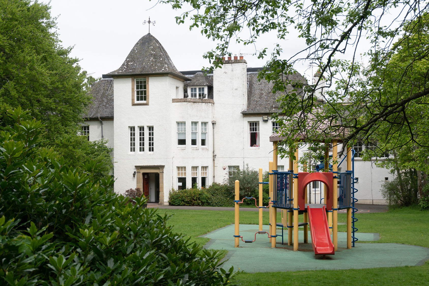
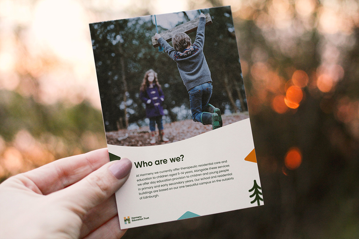
Harmeny is an incredibly unique place which provides therapeutic residential care and education for children aged 5-18. Located on the outskirts of Edinburgh, looking out onto the Pentland hills is a place where children can feel at home and receive the attention and teaching which every child deserves.
Daysix had the challenge of coming up with a new brand identity which better reflects Harmeny and the unique nature of their care education. An identity that will communicate better externally, serve an increasing age range of children and can adapt to varying touch points and applications.
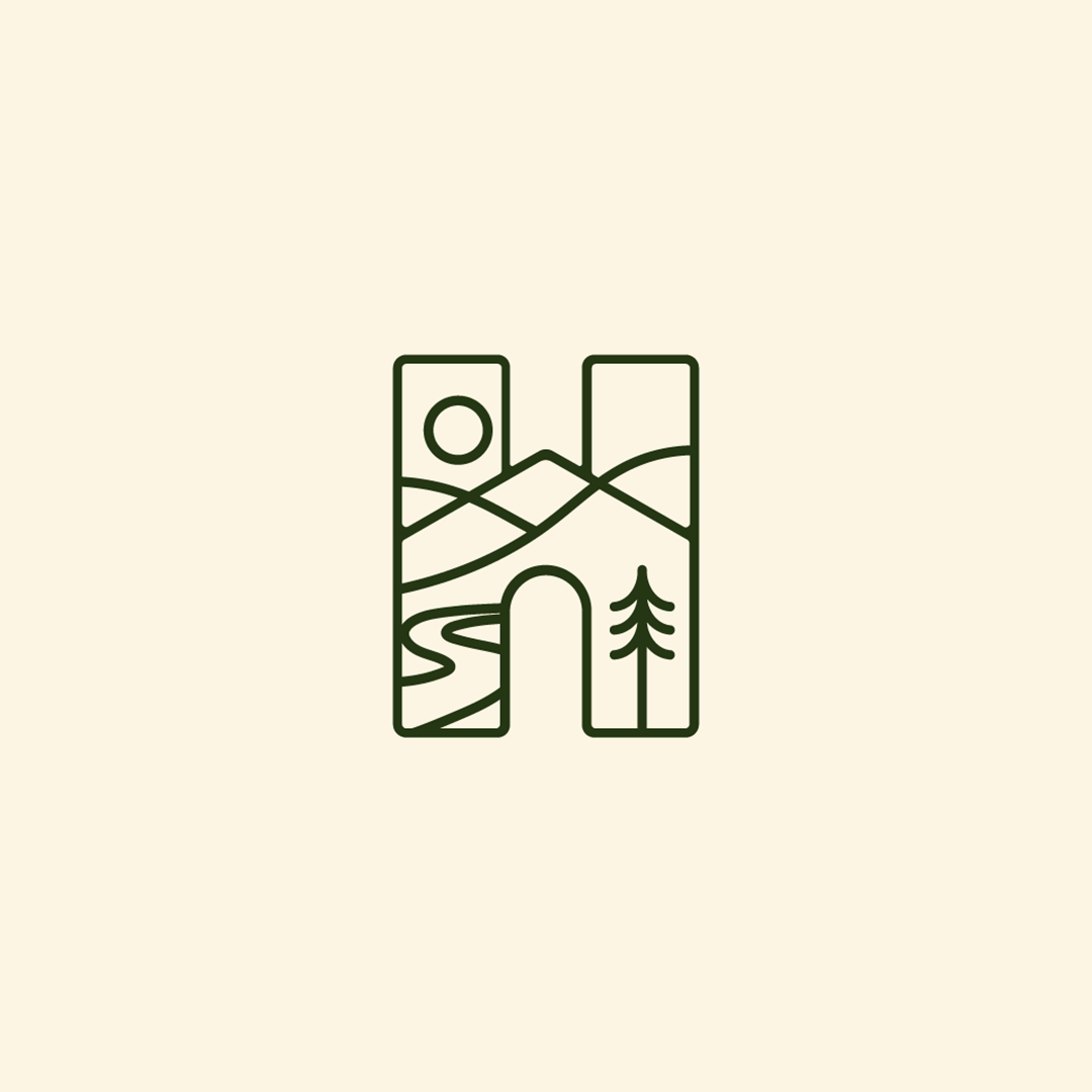
The identity encapsulates several elements that are core to Harmeny. Primarily, the outdoors and a home. The outdoor space of the Harmeny grounds not only gives children a place to play but it is also woven into the curriculum, something unique to Harmeny. It is also a home for many of the children and for those that don’t stay it’s still a place of stability in their lives.

The Process
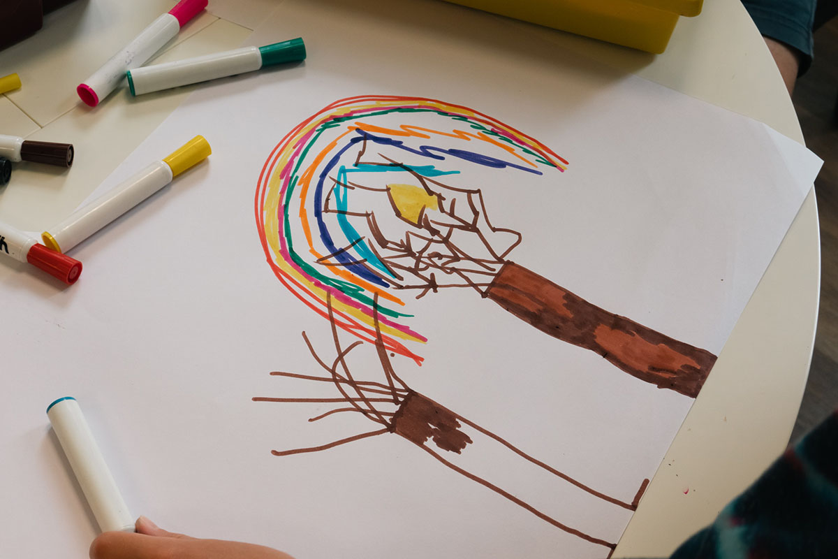
After our discovery session which pinned down what makes Harmeny feel like Harmeny, we went out to meet the staff and some of the children and got the privilege of seeing Harmeny from the childrens’ perspective and what makes it special to them.
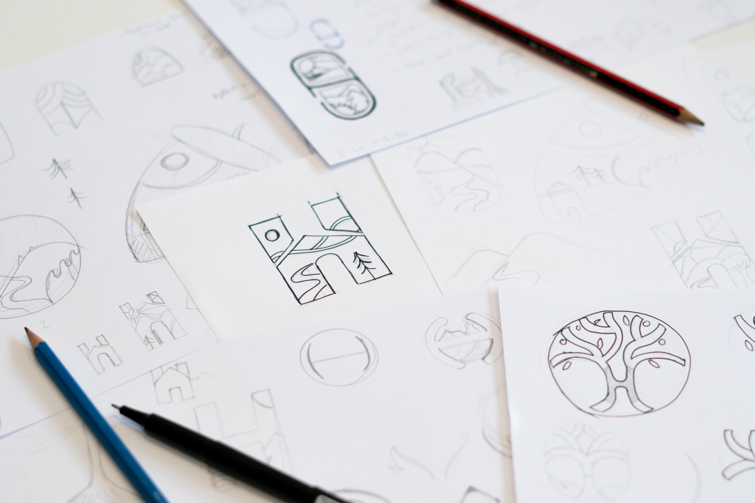
After soaking up as much information as possible we got to work, distilling down what the key themes and core values of Harmeny are and started putting pen to paper.
The Outcome
A modern, versatile identity that reflects who Harmeny are and what makes them unique. A system that will work across various touch points and one that is more inclusive for the wider age range of children.
The people who work at Harmeny have a sincere affection for the children and the result is a relationship of mutual respect between the children and staff. For us it was a pleasure to help out and equip this special place with the necessary materials.

A design system
The design elements taken from the Logo can be used to supplement the visual identity in situations where it feels lacking. For example, a piece of media where the logo itself is absent and using these familiar shapes will bring through the missing visual continuity.
The colour palette is deliberately rooted in nature and has an overall warmth which ties in with the warmth and care that the staff provide for the children.


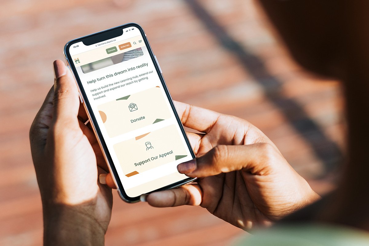
Digital
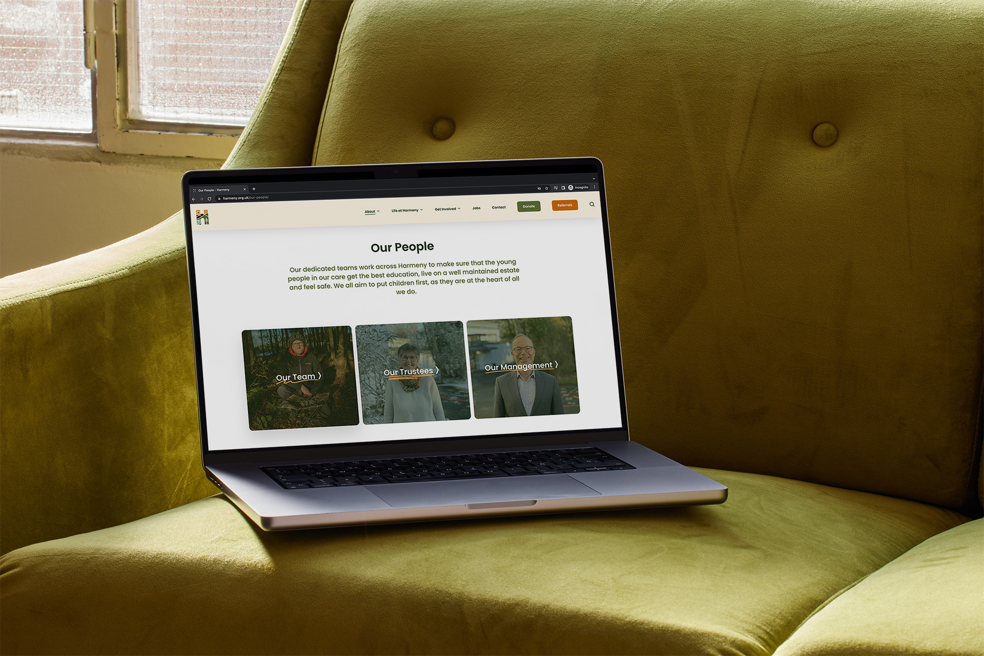
The final stage was to design and deliver a digital home for the new brand to live. An experience which would put local authority leaders at ease about any queries and get kids excited about coming to Harmeny. The website is a crucial asset for Harmeny when it comes to donations and referrals, so getting it right was important.


“All those involved were hugely impressed with how Daysix encapsulated our natural environment and a sense of calm, warmth and home within the logo design. A small number of staff had been really attached to our previous logo, and fearful of what may replace it, but their fears were allayed when they saw our new logo.”
Alison Acosta
Fundraising and Communications Manager, Harmeny